


2021
Cardio Care: Health App & Wearable
UI/UX Case Study
OVERVIEW
CARDIO CARE is a medical device designed and developed on the Internet of Medical Things (IoMT) principles. For this, we worked on two areas: a mobile application and a supporting smart wearable device. The wearable device called the "Live ECG Machine" is connected to the patient's body through probes. It senses and records the patient's heart rate and electrocardiogram and then sends the data to our mobile application, called "Cardio Care." The mobile application has various features such as displaying the BPM, cardiogram, and previously measured parameters, tracking the location of the live ECG machine, and alerting the hospital and patients' emergency contacts in case any abnormal readings are detected.
Our project was selected as the best academic project in our batch of 180 students. We were given the opportunity to present our project before the Dean and external faculty from the National Board of Accreditation (The government body responsible for the accreditation of higher education institutions of India).
Here, I have documented the various steps and procedures that led to the final design of the application. To know more about the hardware complexities involved in making the wearable Live ECG Machine, kindly head over to the end of this page.
Please follow this link to have a look at our project report:
My Role:
-
UI/UX Design
-
IoT Implementation
Team:
-
Me
-
Rishabh Sinha
-
Aarushi Sonal
Timeline:

PROBLEM
Conventional ECG monitors are often costly and bulky, and it’s challenging to maintain a cardiac history of the patients at small intervals. Although other cheaper remote ECG monitoring systems are present in the market that employ mobile features like a camera and flash to form an electrocardiogram, these aren’t error-free as they don’t rely on sensors to get a reading. These devices might not be the best choice for cardiac patients and elite athletes who try to keep their heart rates in specific ranges.
SOLUTION

Designing a Live ECG Machine that the user will directly wear on their chest. This machine will measure the heart rate and send the data to the mobile application, where the BPM and cardiogram of the user will be displayed. The mobile application will have various features such as displaying the BPM, cardiogram, previously measured parameters, tracking the location of the ECG Machine, and emergency contacts. An alert message will also be sent to the hospital and emergency contacts if any irregularity is detected.
DESIGN PROCESS
I followed Design Thinking methodology to design Cardio Care.

User Details
1. Empathize
Qualitative Analysis
To understand user behavior, needs, and motivation I did a Qualitative Analysis of potential users where I conducted user research by interviewing 12 people and then categorized them into two categories: Heart patients and Sportsmen.
The following questions were asked during the interview:
-
What is your name, and how old are you?
-
What is your line of work?
-
Do you have any pre-existing heart conditions?
-
At home, how do you keep track of your BPM and ECG?
-
How many times do you have to check it in a day?
-
Do you use any particular application for it?
-
Do you find it difficult to do so?
-
Do you believe the results are always correct?
-
Will you use an app and a supporting hardware device if we deliver them to you? Do you want to put your time and money into that?
-
Do you have any suggestions about how to improve it?

The key findings from the interview were:
-
Most of the existing applications measure BPM but not ECG.
-
Existing apps aren't always precise in their metrics.
-
The applications are difficult to navigate.
-
The application can be a little sluggish at times.
-
The applications are challenging to use because they contain a lot of medical and technical terms.
2. Define
User Persona
After doing the user research I was able to form the personas of a typical Cardio Care user.
3. Ideate
Pain Points and Solutions
After conducting extensive research, user interviews, and analyzing existing applications, I came across the following pain points and their respective solutions:
Problem 1:
Existing applications measure BPM but not ECG.
Solution 1:
Designing and developing a mobile application along with a wearable - Live ECG monitoring device that uses sensors and probes to measure BPM and ECG. The direct contact of probes with the body of the user ensures greater accuracy in results.
Problem 2:
Excessive use of complex medical terms that is unfamiliar to the user.
Solution 2:
Removing the complex jargon and replacing it with common terms that the user is familiar with.
Problem 3:
Difficulty in navigation.
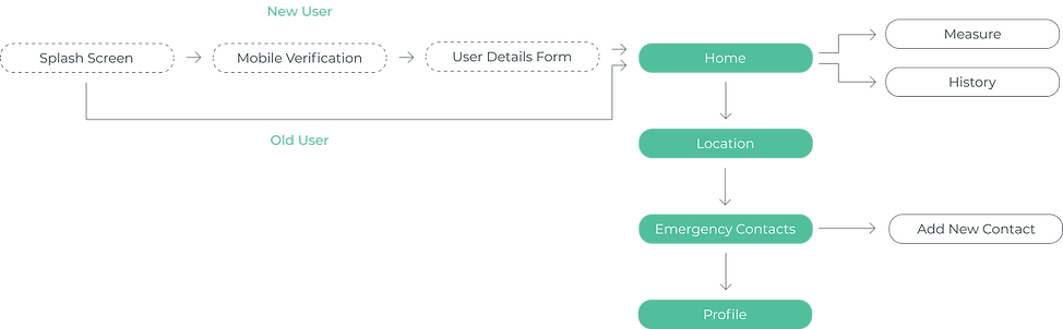
Solution 3:
Dividing the 4 main parts of the application- Home, Location, Emergency Contacts, and Profile into 4 tabs. This way everything is presented right in front of the user in the most straightforward way.
Problem 4:
Inconsistency in elements like fonts, colors, and excessive information overload discourages the user from using them.
Solution 4:
We wanted our product to hit the spot and communicate a sense of security to our users. So, I went with the "less is more" approach by keeping just the right amount of information on each screen and enabling users to get their job done with just 2 clicks. Apart from this, I tried maintaining the consistency in fonts and colors throughout the application.
Information Architecture
I wanted to display the information in front of the user in the most straightforward way possible, causing no frustration. So for that, I arranged the parts of the application and formed a simple information architecture.
Sketches
After deciding on the information architecture, I made some simple sketches of the screens just to get an idea of what goes where.

Wireframes
The information architecture and sketches helped me decide on the layout and flow of the application. So, I then went on to make the wireframes.

Splash Screen


Mobile Verification


Home

Location

Emergency Contacts

Profile
4. Prototype
Style Guide
A color is a powerful tool for influencing people's moods and behaviors. I wanted to instill in our users a sense of safety and trust. As a result, I chose tones of green, a soothing color that represents healing, wellness, and harmony.
#52BF9C
#9BE5AA
#3D4E52

I paired Poppins with Roboto to make the text look clean and clear. This also gave elements a lot of space to breathe.
Aa
Roboto
Aa
AaBbCcDdEeFfGgHhIiJjKkLlMmNnOoPpQqRrSsTtUuVvWwXxYyZz
AaBbCcDdEeFfGgHhIiJjKkLlMmNnOoPpQqRrSsTtUuVvWwXxYyZz
Poppins
Final Designs

Splash Screen
The application starts with a splash screen that contains the logo and name of our application: CARDIO CARE.
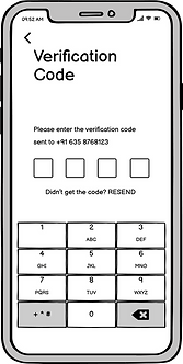
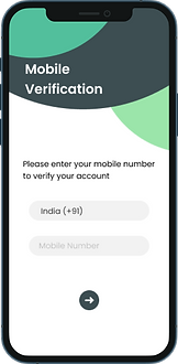
Mobile Verification
Then comes the 'Mobile Verification' screen where the user has to provide their mobile number after which an OTP will be sent to the entered number. The user has to type in the verification code for mobile verification. If the verification fails, this process has to be repeated again.


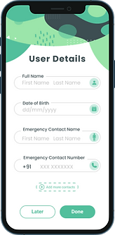
User Details
Once the verification is successful, the user will be required to fill a 'User Details' form which contains basic details such as Name, DOB, Emergency Contact Name, and number, and then click on the 'Done' button.
Our application has 4 tabs: 1. Home 2. Location 3. Emergency Contacts 4. Profile
Home
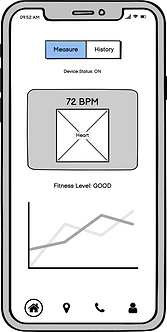
After filling in the details, the user will be directed to the Home screen/tab where there are two options available:
1. Measure BPM and see the ECG
2. See the history
On clicking ‘Measure’, the user will be required to select their most recent activity and then turn the ECG device ON. Once the device is ON, the BPM and ECG will be displayed on the screen. The user's health status will also be displayed as Good, Average or Bad.


On clicking 'History', the user will be able to see the previously measured data like BPM, ECG, etc. on a particular date.
Location


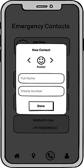
Emergency Contacts
On clicking the 'Emergency Contacts' tab, the user will be able to add new contacts. They can add a maximum of 3 contacts. If there is an aberration in BPM/ECG, an alert message will be sent to the Emergency Contacts and the hospital.
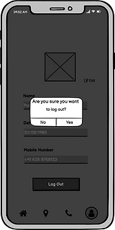
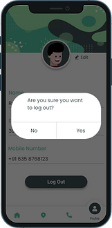
Profile
On clicking the 'Profile' tab, the user will see their personal details (which they entered in the User Details form) such as Name, DOB, Mobile Number, etc. An edit option has been provided if the user wants to change any detail.
At the bottom of the screen, there's a 'Log Out' button. Once the user clicks on it, the session will expire, and the next time user logs in, they'll have to perform the mobile verification process again. Then they'll be directed to the Home screen directly as account formation was already done.


Smart Wearable Device
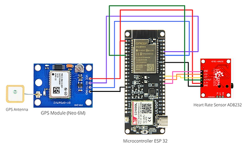
Schematic


Placement of probes

Final Product
5. Test
Due to the ongoing pandemic, all of us in the team had to work remotely. My friend and colleague, Rishabh, was responsible for handling the hardware part of the project to which we did not have access. A huge thanks to Rishabh for putting in the effort to make this video explaining all the details of our project.
I would also like to thank Prajneya, our subject, on behalf of the whole team of Cardio Care for letting us test our product on him.


LEARNINGS
-
I learned how a designer must be more empathetic than usual while designing for people with health issues. I tried listening to all of my users and noting down all the problems they faced to ensure they were addressed while designing the application.
-
As this is a healthcare application, it was imperative to keep it accessible to people with the minimum number of clicks. I kept in mind that our device and application will be used in times of discomfort when a patient doesn't want unnecessary clicks.
-
I also learned how important it is to include the user in each stage of product development because they are the ones who will be using it after all.