

2020
AmbiSwitch: Handswitching App
UI/UX Case Study
OVERVIEW
AmbiSwitch is a mobile application that enables individuals to learn the skill of ambidexterity (hand-switching). In September 2020, my mother encountered a severe dog bite that completely damaged the middle finger of her dominant hand. As a result, she could not even perform the easiest tasks, such as holding a pen or eating with the dominant hand. Considering the injury would take almost 4-5 months to heal, she had no choice but to learn how to use her non-dominant hand to perform daily chores. To help her in this process, I started looking for applications that would enable her to learn hand-switching. Surprisingly, there was not even a single application available for this purpose.
Over the next few months, I conducted extensive research and designed an application to enable people to learn this skill. Simultaneously, I worked on a research paper titled "Mobile Application Design for Ambidextrous Training-Hand Switching." This technical paper was presented at the 2021 IEEE IAS International Conference GUCON at Kuala Lumpur, Malaysia.
Please follow this link to find my research paper -
My Role:
UX Researcher and Designer
Team:
-
Me
-
Professor Sneh Singh (Research Mentor)
Timeline:
September 2020 - September 2021
The finger that was damaged

Image: Mom's healed hands
PROBLEM
Some tasks require the use of alternate hands or fingers to complete them. Moreover, many times hand-switching becomes a necessity in case of injury to the dominant hand. Currently, there are no applications in the market that enable individuals to train themselves to become ambidextrous except for a few games.
SOLUTION

Designing an application that will allow people to learn the skill of hand-switching by incorporating not only games but various other features too that are vital for accomplishing this goal.
DESIGN PROCESS
I followed the Design Thinking methodology to understand the requirements and features for better user experience and interface design.
Empathize
Define
Ideate
Prototype
Test
1. Empathize
Qualitative Analysis - Focused Interview
I conducted semi-structured interviews with 6 people who already practice ambidexterity (hand-switching) to get preliminary insights into their preferences and requirements. For this open discussion, three sets of questions were asked:
-
What is the objective behind learning ambidexterity & what are the current techniques of practicing hand switching?
-
What are the problems faced and factors needed for improvement?
-
What are your needs and preferred feature requirements?
The information received from the interview is represented below:

Quantitative Analysis - Online Survey
I further investigated the information received through the focus interview analytically by the means of a survey.
A total of 235 responses were received out of which 221 were deemed fit for the analysis. The survey respondents were aged between 16-60 years with 200 right-hand dominant, 14 left-hand dominant, and 7 ambidextrous people.
Insights from the survey:
The survey data indicates that 62% of respondents have not heard about ambidexterity but would like to learn hand-switching techniques, 29% of respondents already practice it, and 4.5% are ambidextrous.

4.5%
4.5%
29%
62%
The survey also identified the reason for interest in hand-switching by respondents. The users were allowed to select more than one option. The results indicate 132 respondents want to enhance their skill of both hand dominancy,118 respondents want to develop hand switching as a hobby, and 9 respondents want to practice hand switching due to dominant hand injury.

A question on color preference for the application was asked, and for that, the audience was given a choice of 6 colors. Out of 221 people, 90 people (40.7%) chose color 1 (hex-8E97FD), 63 people (28.5%) chose color 2 (hex-9EC1CF), 25 people (11.3%) chose color 3 (hex-9EE09E), 19 people (8.6%) chose color 4 (hex-FDFD97), 11 people (5%) chose color 5 (hex-FEB144) and 13 people (5.9%) chose color 6 (hex-FF6663). The audience seemed more inclined towards shades of purple and blue. Hence, I incorporated these shades as the primary color in the application.


The last section of the questionnaire was about rating the features identified in the focus interview, i.e., customized schedule, task practice, tutorials, games, more reading links, guided physical exercises & exercise duration guidance. The Likert scale was used for identifying the relative importance of features discovered through the focus interview. Seven features were identified from the interview conducted for application design, and these responses were collected on a Likert scale of 1 to 7.
Relative importance Index (RII)= (7n1 + 6n2 + 5n3 + 4n4+ 3n5 + 2n6 + 1n7) 7N
The RII value was calculated using the above equation for ranking the features. The ranking was as follows:
-
Rank 1 - Guided Physical exercises (most important)
-
Rank 2 - Practice sessions/tasks
-
Rank 3 - Exercise duration guidance
-
Rank 4 - Hand switching games
-
Rank 5 - Tutorials
-
Rank 6 - Making of your own schedule
-
Rank 7 - More reading and information links (least important)

Competitor Analysis - Market Research
I reviewed few mobile applications to get insights into the functionalities and other design aspects of current applications.

Below are some observations from the review process:
-
None of the apps provide guided physical exercises to strengthen the non-dominant hand.
-
None of the apps provide practice tasks such as mirror writing- making a mirror image of letters written with the non-dominant hand, mirror drawing- making a mirror image of drawings made with the non-dominant hand, typing with the non-dominant hand, etc.
-
All apps (5 out of 5 apps) have the game feature which focuses mainly on thumb switching.
-
Only 1 out of 5 apps has the feature of multiple games. 4 out of 5 provide only one game.
-
None of the apps provide a customized schedule that best suits the user.
2. Define
User Persona
After doing extensive research I was able to form personas of a typical AmbiSwitch user.


3. Ideate
Brainstorming
The results received from the focus interview, online survey, and mobile application review process gave insights into the various problems a potential user faces. I tried brainstorming ideas and came up with possible solutions that can eliminate those problems.
Problem
No guided physical exercises
No practice tasks
Single Game
No customized schedule
Solution
Incorporating all the physical exercises such as non-dominant hand weight lifting, hand grip strengthening, and exerciser, etc into the application
The application will contain practice tasks on how to write and draw with the non-dominant hand, mirror-writing, brushing, eating, holding a spoon, tying shoe laces with the non-dominant hand, etc.
The application will contain multiple games which will help with thumb-switching, hand-switching, and hand-eye coordination.
The exercises, tasks, and games will be customized according to the user’s age, needs, goals, and how much time they can devote per day. The schedule will also depend on whether the person was already ambidextrous, wants to practice it due to injury-induced hand dominance transfer, professional goals, or just as a hobby.
Information Architecture
Next, to display the information easily while at the same time incorporating all the features that the users desire, I formed an information architecture. This helped me understand what goes where in the application.

Sketches
After deciding on the information architecture, I made some simple sketches of the screens just to get an idea of what goes where.

Wireframes
The information architecture and sketches helped me decide the layout and flow of the application. So, I then went on to make the wireframes.

New User
.png)
.png)
.png)
Splash Screen
Old User
Onboarding
Sign Up
User details
and schedule
.png)
Login

.png)
Home
.png)
Exercises
.png)
Tasks
.png)
Games
.png)
Profile
4. Prototype
Style Guide
Since most of the users chose #8E97FD as the primary color, I paired it with light purple and grey. I chose shades of periwinkle to represent originality, and tranquility and encourage creativity. The combination of periwinkle and grey creates a pleasing color hierarchy.
#8E97FD
#E8EAFF
#3F414E

I paired Open Sans with Poppins to make the text look clean and clear. This also gave elements a lot of space to breathe.
Aa
AaBbCcDdEeFfGgHhIiJjKkLlMmNnOoPpQqRrSsTtUuVvWwXxYyZz
Open Sans
Aa
AaBbCcDdEeFfGgHhIiJjKkLlMmNnOoPpQqRrSsTtUuVvWwXxYyZz
Poppins
Final Designs
Splash Screen
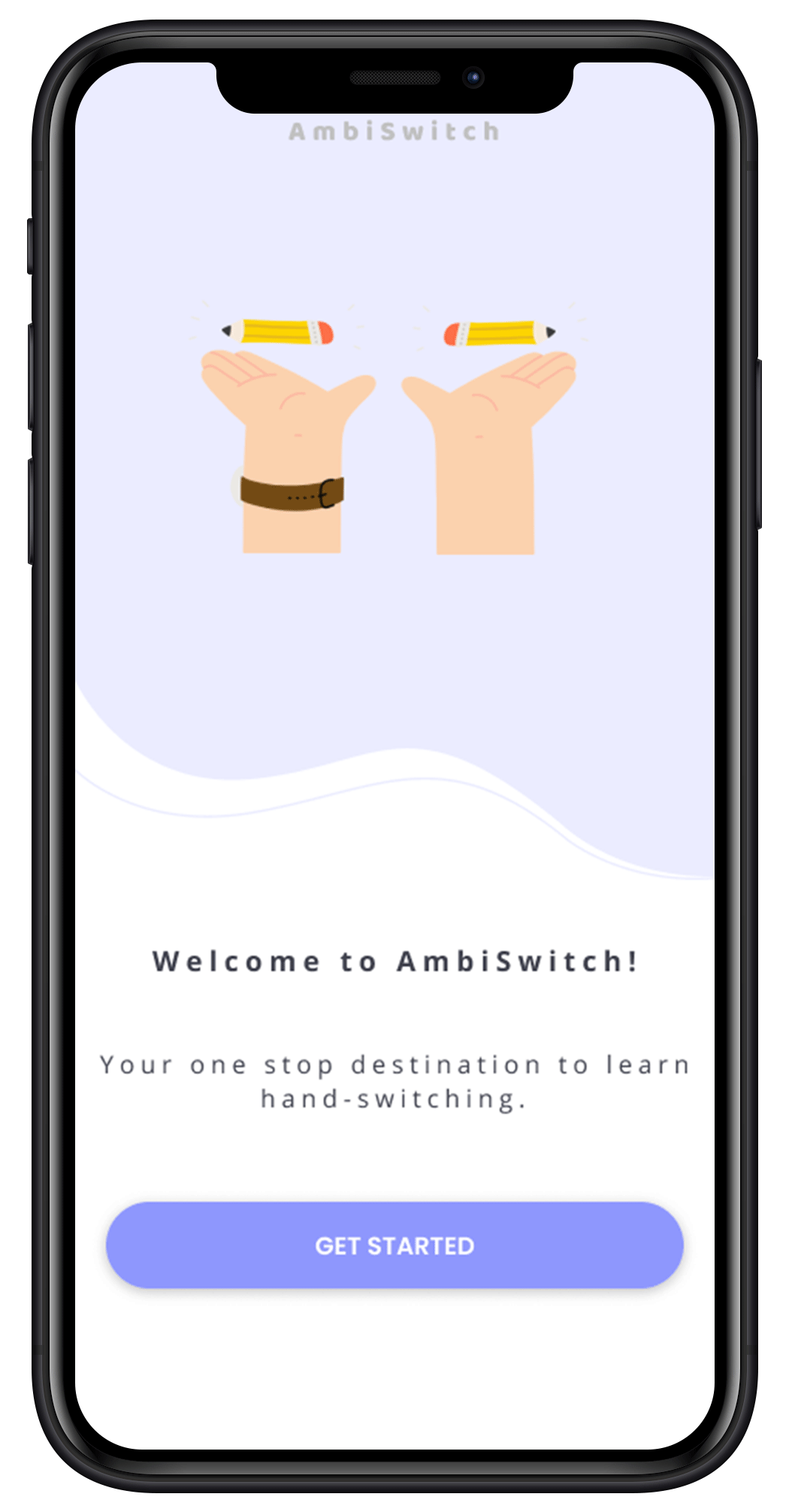
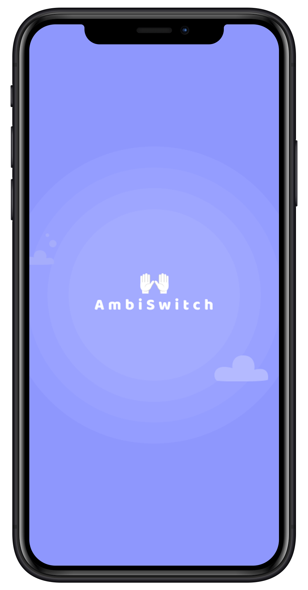
The application starts with a splash screen that contains the logo and name of our application: AmbiSwitch.
Onboarding
Then comes the Onboarding screen which has a short description of what the application is about. On clicking the “Get Started” button, the user will be directed to the Sign-Up screen if it is their first time visiting the application. If the user has visited the application previously then they will be directed to the Login Screen.
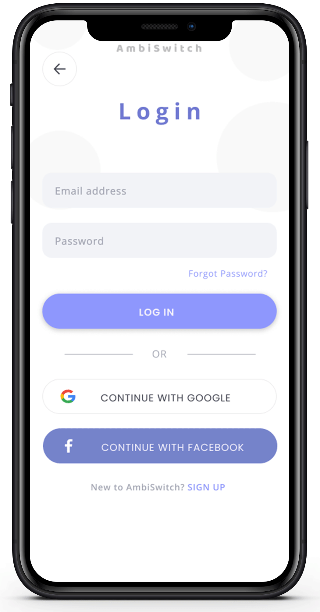
Login
On filling in the details and clicking on the “Login” button, the user will be directed to the Home screen. The option of logging in using Google or Facebook has also been provided.
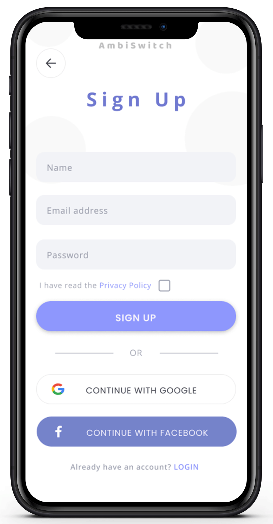
Sign Up and User Form
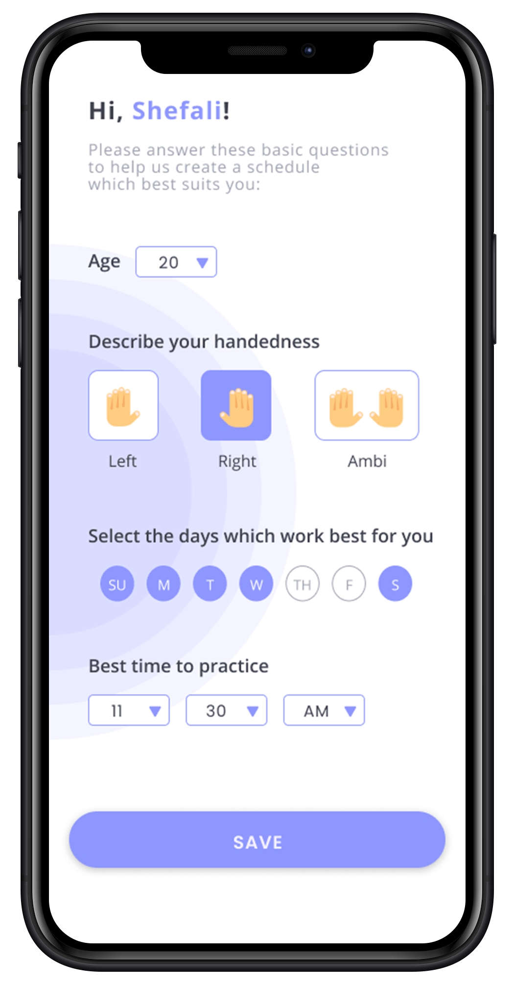
For first-time users, in the Sign Up process, users will be required to provide information such as name, email address, and password. They can also choose to Sign Up using Google or Facebook. After signing up, the user will be required to fill out a short form with basic information such as their age, handedness, the days on which they want to practice, and also the time which is best for them. On clicking the “Save” button their profile will be created and a customized schedule will be made with the information they provided. Then the user will be directed to the Home screen.
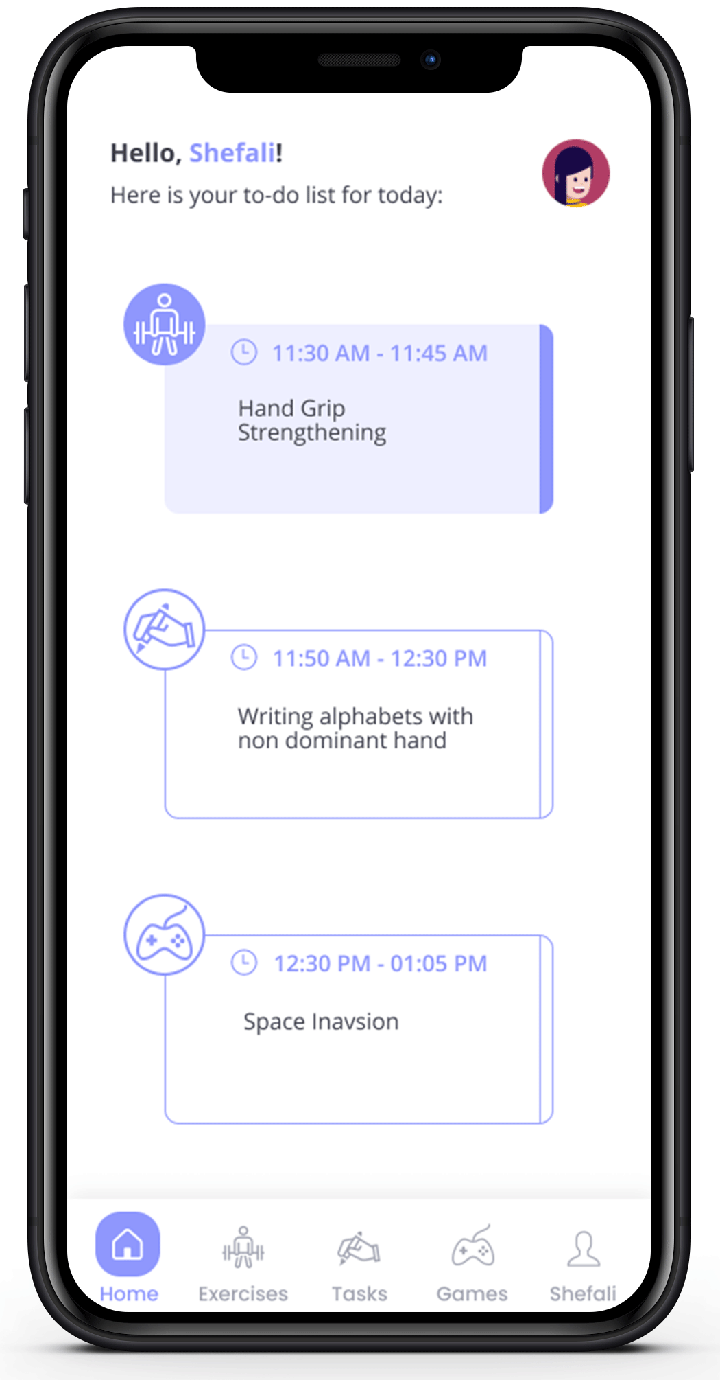
Home
For each session, the user will be required to complete 3 sections - 1 exercise, 1 task, and 1 short game session. These sections are sorted out in the form of cards. The Home Screen displays what the user is required to do for each of the 3 sections and the duration for which it has to be done on each card. Once the user completes any section, the color of the card will change from white to purple indicating that the particular section has been successfully completed. The 3 cards – Exercise, Task, and Game are clickable. On clicking the card for a particular section, the user will be directed to the respective screen. In addition to this, the user can also use the bottom Navigation Bar for switching between these screens.
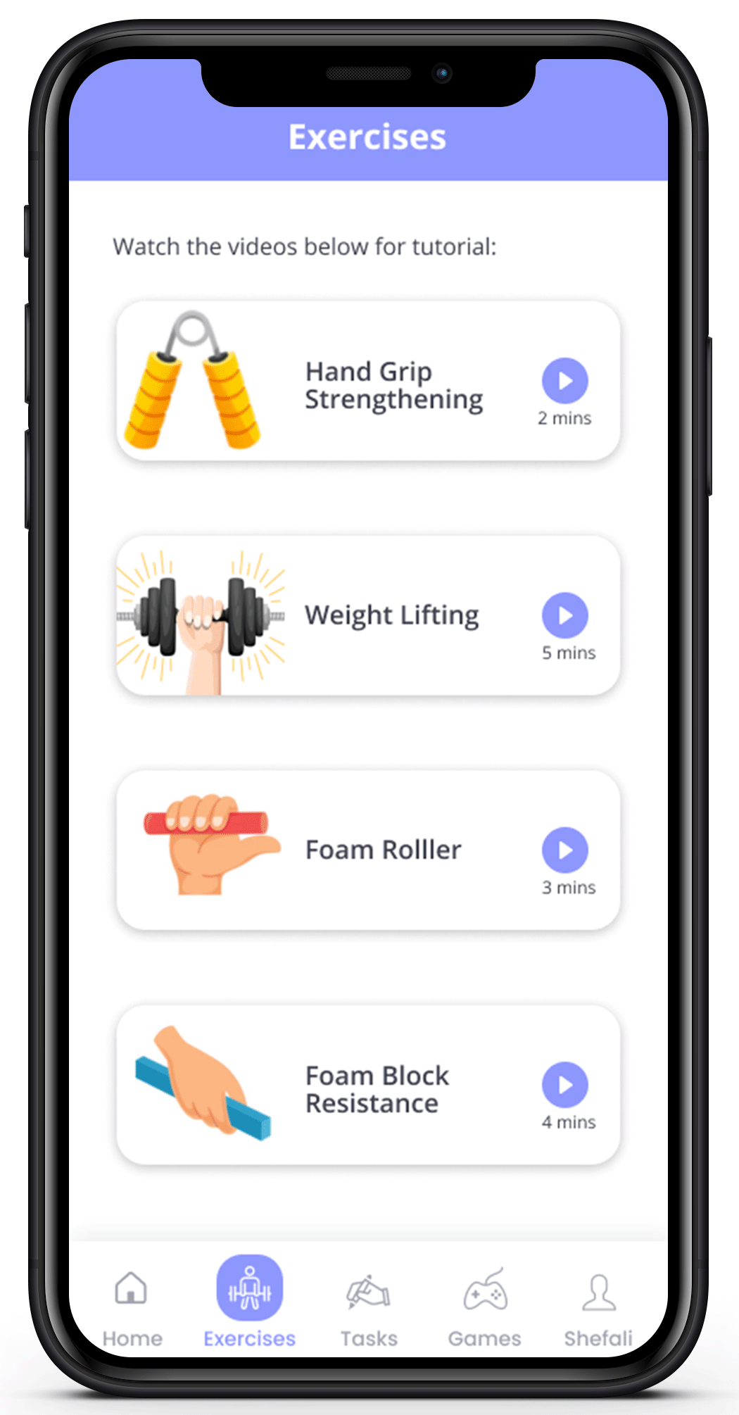
Exercises
In the Exercises screen, there will be a list of guided exercise videos provided to the user. They can scroll down and select the video of the respective exercise which has been assigned to them. On clicking the card of the exercise, a video will start playing which will teach the user how to do that exercise.
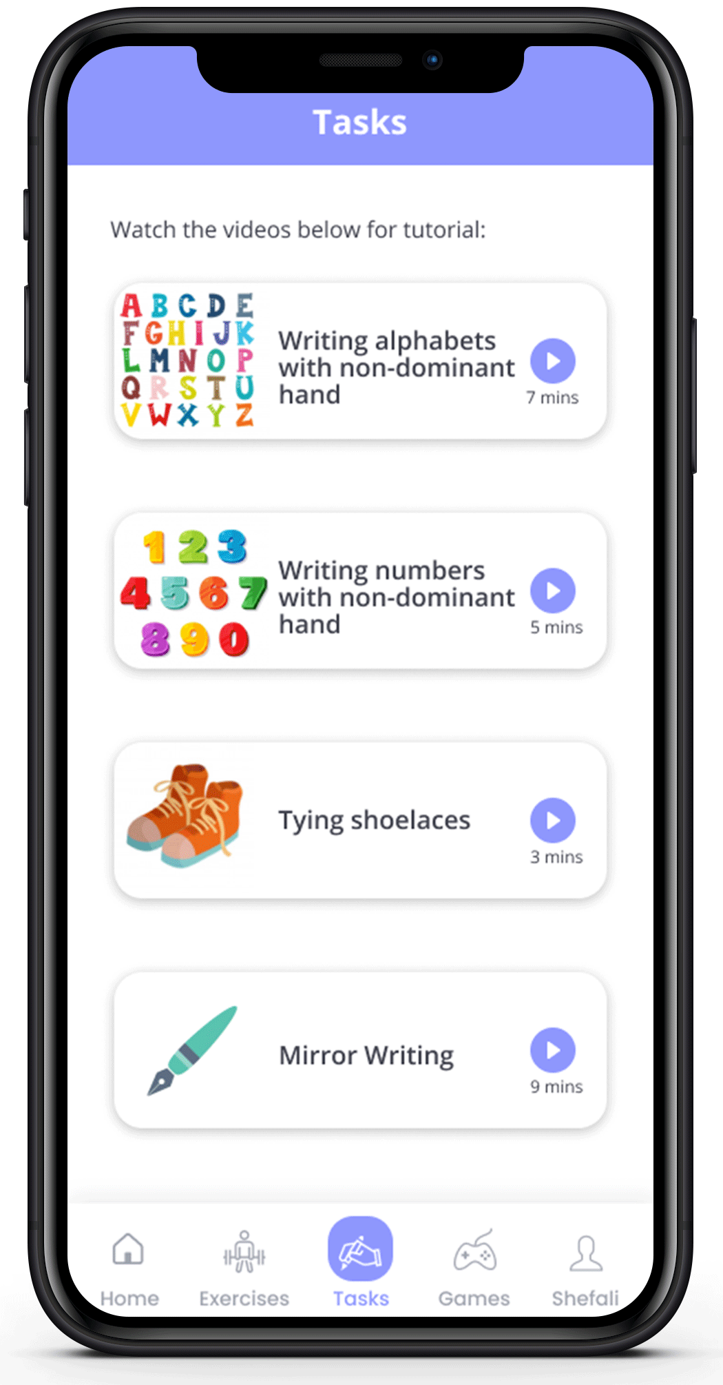
Tasks
Similarly, in the Task screen, there will be a list of task videos provided to the user. They can scroll down and select the video of the respective task which has been assigned to them. On clicking the card of the task, a video will start playing which will teach the user how to perform that particular task.
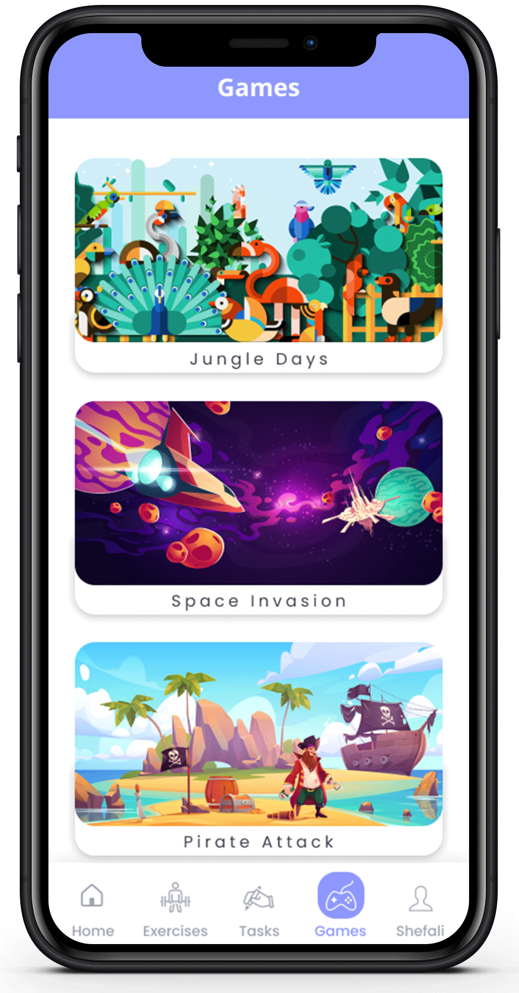
Games
In the Game screen, there will be a list of games. The user can select and play the game assigned to them.
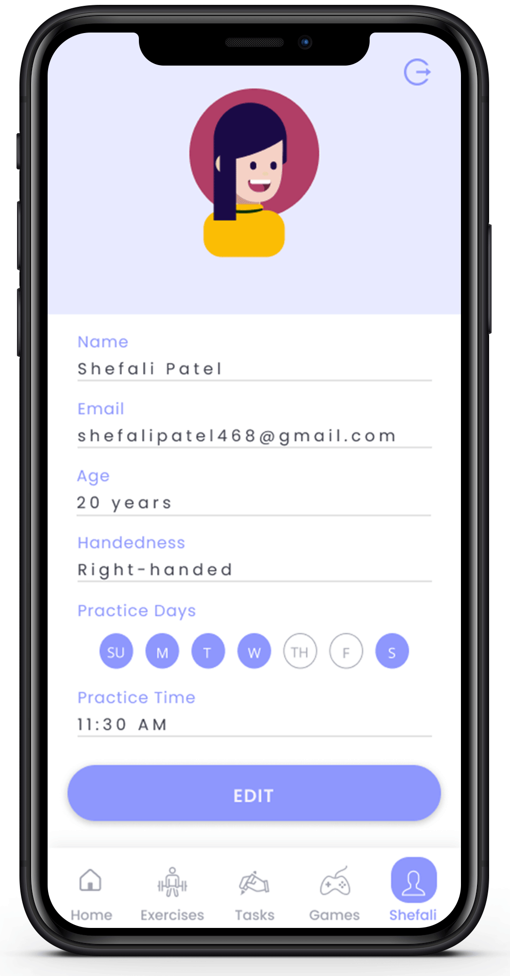
Profile
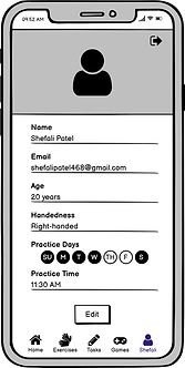
On clicking on “Profile”, the user will be directed to the Profile screen. The Profile screen displays the Name, Age, Handedness, Practice Days, and Practice Time of the user. The information displayed here is the one that was collected from the user during the Sign Up process. In case the user wants to edit any information or make changes to the practice day and time, they can simply change it and click on the “Save” button. The changes will be made and a new customized schedule will be created. On the top right of this screen, the “Log Out” option has been provided.
5. Test
Usability Testing
After finishing the visual designs, I tested the prototype with 3 potential users to see if they could use it effortlessly. To see how they interacted with the application, I asked them to complete the following tasks.
-
Sign up and complete the user form.
-
Navigate to the exercise, task, and games screen from the home screen.
-
Edit user profile.

User 1

User 2

User 3
The participants breezed through the tasks and offered the following suggestions:
-
Add a feature that allows people to engage with each other using this app and build an online community to practice together.
-
A feedback form can be added.
-
More customization features can be introduced, including additional activities and exercises depending on user comments and requirements.
LEARNINGS
-
I learned a lot about the research process that goes into creating a product, and one of the most significant things I learned was how to grade features based on the preferences of the users. This project taught me how to use the Likert scale and calculate RII values, which came in handy while building the app.
-
Through the use of Google forms and interviews, this project taught me a lot about ambidextrous people in general, and how something simple for us can have a significant impact on the statistical minority. I learned the importance of involving the user in every step of the design process.
-
It also taught me how to design things without assuming anything or having any biases. Before floating the form, I assumed that customers would prefer reading links in the app over a customized schedule, however, the results were quite the opposite. As a result, I learned how to design and be flexible in the face of change while avoiding any external biases.
2021 IEEE IAS GUCON

COPYRIGHT
Operating manual for AmbiSwitch application
